Gas Prices

  • Subscribe to our RSS feed.
  • Twitter
  • StumbleUpon
  • Reddit
  • Facebook
  • Digg

Tuesday, 10 December 2013

< Sigh > If only there were a way to count people who aren't looking for work, but want a job now. Oh, wait ...

Posted on 06:00 by Unknown

 - by New Deal democrat

It's tough to be a Doomer these days.  Almost none of the data is cooperating.  But at least one crutch they can always lean on is alternative unemployment measures that show a higher unemployment rate than the official 7%.  It used to be that you could make a good case by citing the alternative U-6 rate that counts the underemployed.  But even though that remains unconscionably high at 13.2%, it has been dropping in tandem with the official rate, and is down 3.9% from its peak in 2009 of 17.1%.  It is now almost as low as the 11.8% rate in 1994 when the series was first published.

So the new methods work from pre-Great Recession employment to population ratios.  One such method, favored by Mish and Naked Capitalism, is to assume that, except for the 2008-09 recession, the employment to population ratio would  have remained constant at its level of about 10 years ago.  This method boils down to, "What would the unemployment rate be in an alternative universe in which there were no Baby Boom, and Boomers weren't retiring in droves?" and has about as much credibility as that quote implies.

But there is a more sophisticated method that has been promoted by the Economic Policy Institute.  They describe their method as designed to count "missing workers."  They say:
In today’s labor market, the unemployment rate drastically understates the weakness of job opportunities. This is due to the existence of a large pool of “missing workers”—potential workers who, because of weak job opportunities, are neither employed nor actively seeking a job. In other words, these are people who would be either working or looking for work if job opportunities were significantly stronger. Because jobless workers are only counted as unemployed if they are actively seeking work, these “missing workers” are not reflected in the unemployment rate.
(Bold is my emphasis. We'll come back to that later.)

That method extrapolates from a November 2007 study by the BLS, which projected a trend going forward at that time, and which estimated the impact of Boomer retirements on that trend.  Since that established the secular baseline, so the theory goes, so any deviation from that trend must show the "real" unemployment rate due to the Great Recession.  Using that methodology, the EPI estimates that there are 5,660,000 "missing workers" as of November 2013, and so the current "real" unemployment rate is 10.3%, as shown in this graph:

Photobucket Pictures, Images and Photos

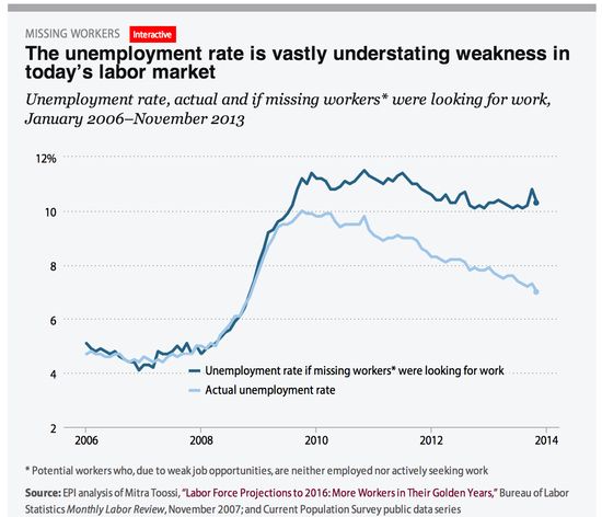
See? told ya!  There's no real "recovery" after all!

In essence, what the EPI describes as "missing workers" are, as one advocate of their methodology has said, are people who "have no work and aren't looking but want a job."
Sigh.  Now, if only there were some way, some official statistic, that was more current than 2007 estimate, that measured the number of people not in the labor force, but who want a job now.  It would probably be called something like "Not in Labor Force, Want a Job Now."

Sort of like the data series from the Household Survey called, ummmmm, errrrrr, "Not in Labor Force, Want a Job Now"!

Yes, ladies and gentlemen, there is a seasonably adjusted data series, updated by the Household Survey and included in the Jobs report every single month, which measures exactly what the EPI says it is trying to estimate in that phrase I bolded from their explanation:  the number of people who haven't looked for a job in the reference period, but want a job now.  And here it is:

Photobucket Pictures, Images and Photos

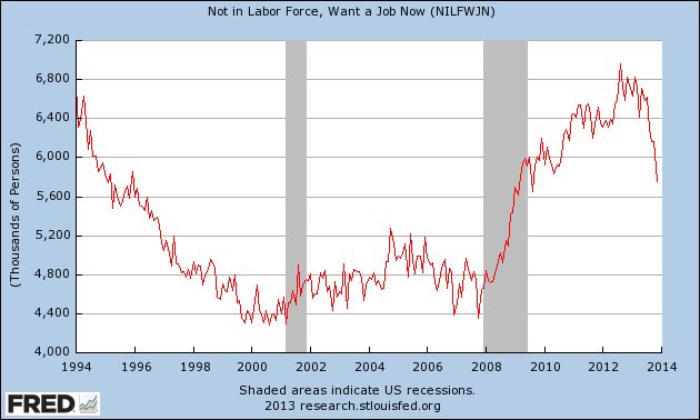
As you can see, that number increased by 50% from trough to peak.   And currently the number of such people is 5,740,000, which is very close to the EPI's estimate.

But what does that mean for the unemployment rate, if this group were included? Since the unemployment rate is the number of unemployed divided by the civilian labor force of which they are a part, to include those who want a job but haven't looked, we have to add them to both numbers, I.e., the numerator and the denominator.  When we do that, here's what the number looks like since the start of the recession:

Photobucket Pictures, Images and Photos

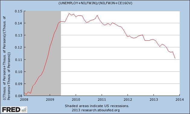
Well, lookie there, just over 10%, just like the EPI's number. See, it's really not a "recovery," right?

Wrong.

For starters, we didn't go from 0 "missing workers" in 2007 to 5.5 million now.  According to the actual data, at its trough in 2007, the series measured 4,390,000 people. At its height in August 2012, it measured 6,956,000, before falling almost half the way back to its pre-recession low as of now. And at 5, 740,000 this is almost identical to the number in February 1995, not notably an awful period for the economy - and that's before adjusting for population growth since.

But the bigger problem for Doomers is that the data series "Not in Labor Force, Want a Job Now" goes back to 1994.  So here's what happens to the unemployment rate when we include this group over the entire 20 year period:

Photobucket Pictures, Images and Photos

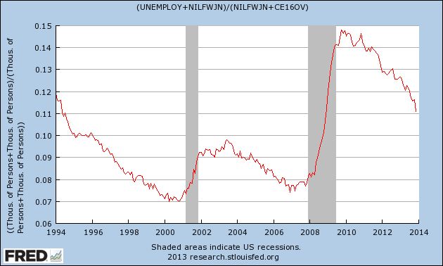
The lowest rate ever is 7%, and the unemployment rate is as low now as it was in 1994.  And since the end of the Great Recession, it has dropped from just under 15% to just over 11.%.

So, while I would count the EPI as among the "good guys," I'm at a loss for why we should be counting anybody who says they don't want a job now as among the unemployed.  Unless and until the EPI gives me a reason to think otherwise, between the EPI's estimate based on a study from 6 years ago, and the Household Survey's actual number, updated monthly, of people want a job now but haven't looked, as far as I am concerned the Household Survey is far more accurate.

Finally, look what happens when we extrapolate by adjusting the official rate to fit the trend including this group, and extend the series all the way back for 50 years:

Photobucket Pictures, Images and Photos

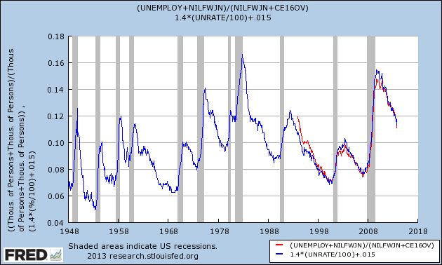
It looks like the current number is on par with the recoveries from the severe 1974 and 1981 recessions.

Oh.

Like I said, it's tough being a Doomer these days.  The data just isn't cooperating.

Email ThisBlogThis!Share to XShare to Facebook
Posted in | No comments
Newer Post Older Post Home

0 comments:

Post a Comment

Subscribe to: Post Comments (Atom)

Popular Posts

  • Median family income continued stagnation in 2012
    - by New Deal democrat Berkeley Professors Saez and Piketty have updated their work on family income in the US through 2012, making use o...
  • Initial claims last week ex-California computer glitch ~327,000
    - by New Deal democrat Computer issues in California continue to bedevil the weekly initial jobless claims reports. We can make a good es...
  • Oil Becoming Potential Major Economic Threat
    Oil is quickly becoming a potential major threat to the economy. Oil hit resistance at the 98 level five times during the first half of 2013...
  • An NDD holiday special: semi-healthy pecan pie with maple, caramel, and peanut butter
     - by New Deal democrat My mom made a  terrific pecan pie.  Unfortunately, most pecan pie recipes basically consist of corn syrup, sugar, an...
  • Weekend Weimar, Beagle and Pit Bull
    I'll be back on Monday; NDD will be here over the weekend.
  • A thought for Sunday: an undemocratically elected minority of anarchists
    - by New Deal democrat An old cynical political saw says that, "in a democracy, people get the government they deserve." As it ...
  • Why even debating breaching the debt ceiling is a Big F*g Deal: a nonpartisan note
    - by New Deal democrat Regardless of your politics, you should care very much not just whether or not we actually fail to increase the deb...
  • The Rising Yuan And Slowing Chinese Growth
    Above is a weekly chart of the yuan ETF over a three year period.  In the 2H09 and most of 2010 we see a relative level of stability, save f...
  • No Commodity Based Inflation in the Works
    Above is a weekly chart of the overall commodity index for the last three years.  While heavily weighted towards oil, other commodities are ...
  • 2014 forecast: a year of deceleration
       - by  New Deal democrat My method of foecasting is pretty simple. In fact, so simple, I call it the K.I.S.S. method. Even though the LEI ...

Categories

  • Australia
  • Auto
  • Brazil
  • Canada
  • Chile
  • China
  • CPI
  • employment
  • Europe
  • GDP
  • Germany
  • India
  • Investment
  • ism manufacturing
  • ISM Service
  • Japan
  • Mexico
  • PCE
  • Peru
  • PPI
  • UK

Blog Archive

  • ►  2014 (7)
    • ►  January (7)
  • ▼  2013 (293)
    • ▼  December (54)
      • International Economic Predictions for 2014
      • Marking my forecast for 2013 to market
      • Rethinking the EUR/USD Double Top Thesis
      • The Important economic trends of 2013
      • A thought for 2013: The Progressive Economic Case...
      • Weekly Indicators for December 23-27 at XE.com
      • International Economic Week in Review
      • OH NOES!!! So far in the year of Obamacare implem...
      • Year-end posting
      • An updated look at the real personal savings rate
      • Chinese Debt Levels Reaching Concerning Levels
      • Santa had a very rough night ...
      • Double Top For EUR/USD? [Link Fixed]
      • One graph shows why the present stinks (and why th...
      • The Long-Term Pound/Yen Chart is Very Bullish
      • Weekly Indicators for December 16-20 at XE.com
      • International Week In Review: Let the Tapering Begin
      • Weekend Weimar and Beagle
      • Yesterday's poor initial jobless claims report: so...
      • Interest rates' effect on housing in 2014
      • What Will Be the Biggest International Economic St...
      • Latest UK Employment News is Pound Bullish
      • Subdued inflation takes average wages to near 3 ye...
      • The Big International Economic Events of 2013
      • Industrial production now higher than before reces...
      • France Holding Back EU Recovery
      • An NDD holiday special: semi-healthy pecan pie ...
      • International Week in Review: China Still Growing,...
      • Weekly Indicators for December 9-13 at XE.com
      • Unemployment: positive and improving, but not good
      • US Consumers Remarkably Resilient
      • A note about today's initial jobless claims and re...
      • US Dollar Still In An Uptrend Verses the Canadian ...
      • An updated look at the US long leading indicators
      • Pound is Breaking Out Thanks To Strong UK Economic...
      • Oil Rebounds From Recent Lows
      • < Sigh > If only there were a way to count people...
      • Longer Term US Charts Still Bullish
      • A thought for Sunday: Why stagnant wages and trend...
      • Weekly Indicators for December 2-6 at XE.com
      • International Week in Review: Central Bank Holding...
      • On Social Security, "doing nothing" is the best op...
      • November jobs report: a solid positive month (but ...
      • ISM Report Shows Potentially Strong Economy
      • US Employment Is Still Weak
      • Pensions and Bankruptcy: a fix is available and sh...
      • Sorry, Doomers, there really, truly, honestly, STI...
      • French and Italian ETFs Trading Right At Support
      • ISM manufacturing suggests above trend GDP growth,...
      • US Yield Curve Is Widening
      • Potential Housing Bubble Keeps the Reserve Bank of...
      • British Pound is Rallying
      • The anatomy of median wage stagnation: paltry wag...
      • Junk Bond ETF Breaking Out on Daily Chart
    • ►  November (38)
    • ►  October (58)
    • ►  September (79)
    • ►  August (64)
Powered by Blogger.

About Me

Unknown
View my complete profile